I often start my day by opening up a browser and checking the weather. A couple months ago when the weather site loaded, it looked completely different! It took me a few minutes to learn the navigation of the site and all was well. But why did they change the site? It appears there was no new or different information--it was simply a cosmetic upgrade with different navigation. I felt a few minutes of my life had been wasted for no reason.
Just this week a colleague of mine asked me to troubleshoot some scanning software. Apparently there was a link to “Scan additional pages” and now it was missing. It turns out the link had been replaced by a graphic icon with a picture of a page with a “plus” sign in the middle of it. Easy enough for a technical person such as myself to figure it out, but not a normal computer user in this case.
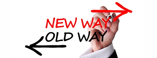
Sometimes simple changes are a good thing
As you may have noticed, many sites and applications use icons now that are somewhat “standardized” with some sort of graphical image. You may notice a set of horizontal bars in a corner of a page that represents the “Menu” link. A plus sign may represent an “Add” link, and a red “X” may indicate a “Delete” link. A magnifying class may represent a “Search” link, and so on. Research has shown wider acceptance of these icons rather than a spelled out link. But this research is based on people “NEW” to a system, not existing users. This is where it gets a bit complicated.
Software companies must stay with the times. They must adopt some of these newer technologies or they will be perceived as “stale”. But when the software changes, it throws a huge wrench into existing users. For a large application site with hundreds of pages, the change management issues would be overwhelming.
Fortunately, GVT/FAMCare customers can have their cake and eat it too.
Over the last two years, we have rolled out theme changes based on the newer icon based technology, created pages that emphasize white space and a “cleaner” look, and have also introduced a favorites bar within the menu structure to great improve navigation. For new users of FAMCare, it’s a great improvement. But we have thousands of users who are used to the old gradient green/gray backgrounds with gold ribbons. Fortunately for those users, as we roll out automated upgrades, they still see the same screens! Only a conscious change (usually with the help of the GVT team) causes the new themes to be rolled in, and if necessary, GVT can even accommodate a mix of themes with different users.
GVT is committed to the embracing of new technologies while understanding that our core user group (mainly social workers) may have a different speed as far as implementing it. As a GVT customer, you’ll not have to worry about logging into your application and wondering “Why did they change my site?”
So let us know how you feel about this? Good move on our part?